California Cafe & Bakery packaging design by Kristina Gorobets.
Role: Graphic Designer, Branding
Team: Branding was done fully by me, however, I collaborated with Michelle Swofs on a website for the brand.
Context: Personal project initiated by my desire to practice packaging design and branding. The website portion was completed as part of IAT339: Web Design and Development course with Michelle Swolfs.
Tools: Adobe Illustrator, Adobe Photoshop, Procreate, HTML, CSS
Process
Art Direction
I started by gathering images that fit my vision for the brand's art direction on Pinterest, and then compiled them into this moodboard.
California Cafe and Bakery mood board collected and assembled by Kristina Gorobets.
Logo Development
I started the branding process by working on the logo. I sketched a few dozen rough logo ideas (that I have since unfortunately been lost) and chose my favorite versions. I took photos of the sketches, imported them into illustrator, and played with colors and positioning until I came up with these five versions.
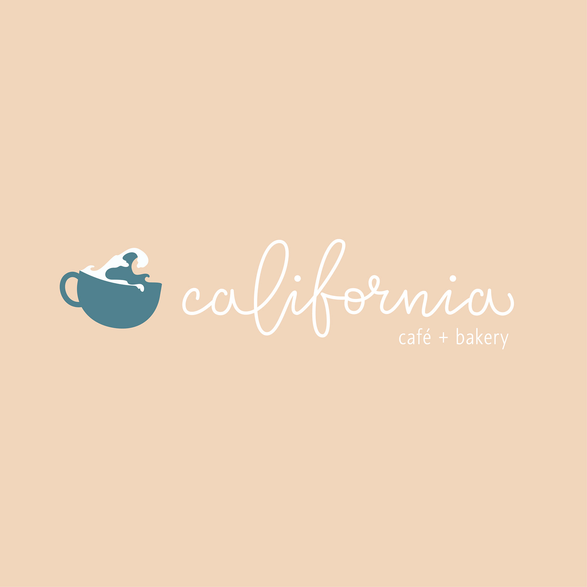
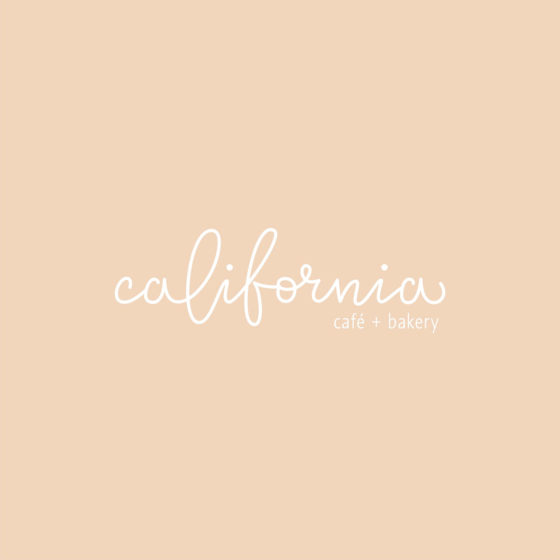
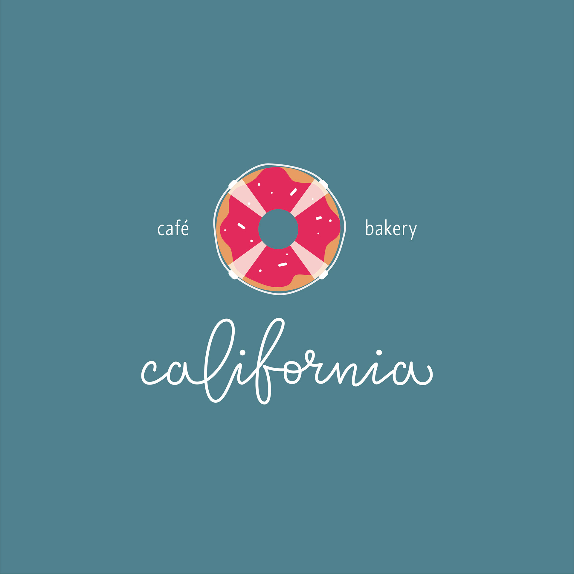

California Cafe and Bakery initial logo versions. From left to right, top to bottom: Cup logo with calligraphy; Calligraphy only; Doughnut-buoy logo with calligraphy; Doughnut-buoy logo with curved calligraphy; and cup logo with curved calligraphy, all by Kristina Gorobets.
The Result
Logo
I created an Instagram poll to see which versions people liked the most, and since many of my friends are designers, I had a decent pool of reliable opinions.
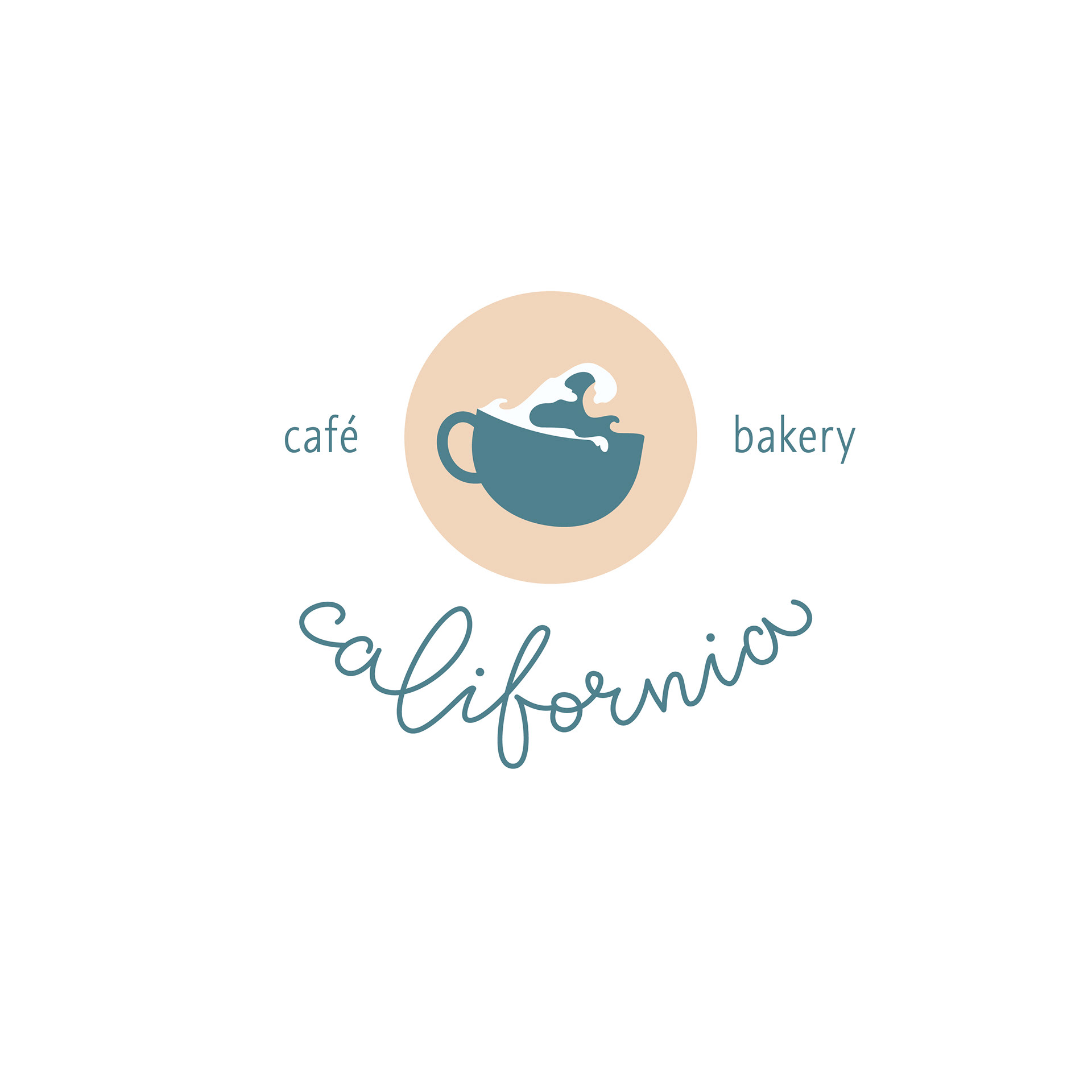
After picking the winner, I used Procreate to hand-draw the "California cafe & bakery" around the cup, once again imported a sketch into illustrator, and used the pen tool to vectorize the letters.
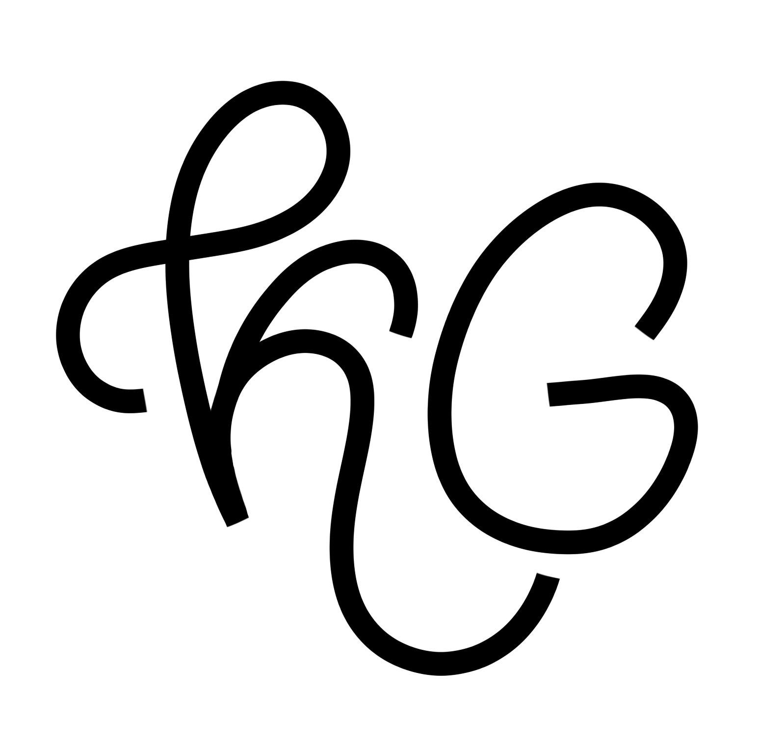
Here, you can see the black & white version of the logo, the color version, and a wordmark. Each of these has it's own use, and the cup logo has received many compliments.
California Cafe and Bakery final logo (black and white variant) by Kristina Gorobets.
California Cafe and Bakery final logo (color variant) by Kristina Gorobets.
California Cafe and Bakery final logo (word mark variant) by Kristina Gorobets.
Packaging
Although creating the packaging has always been the goal, I drew the packaging illustrations and layout after I'd started a web design project with my fellow SIAT student Michelle Swolfs for IAT339: Web Design and Development. Michelle came up with a few coffee roast names, and I used them for the packages you see here.
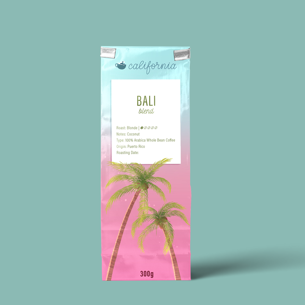

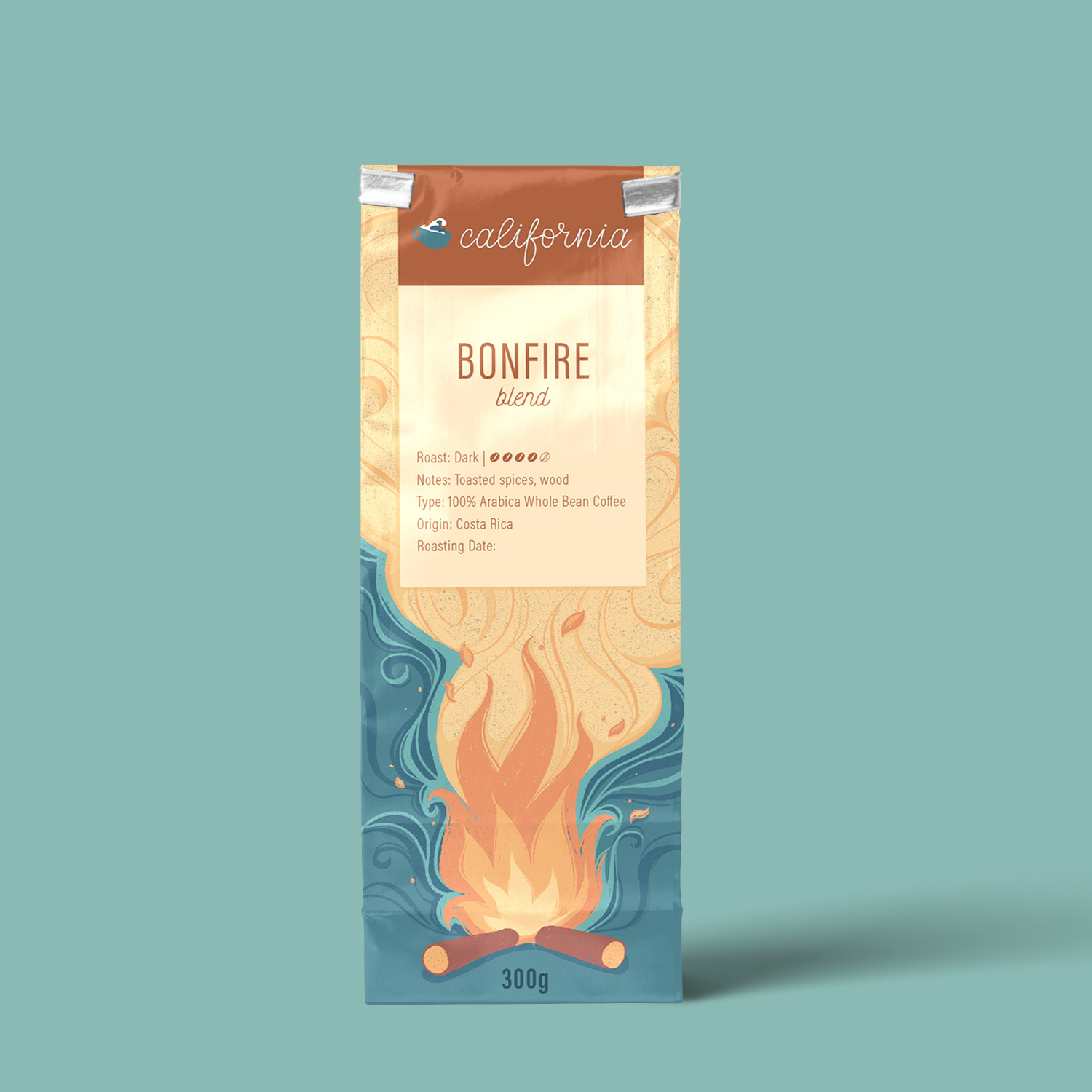
California Cafe and Bakery coffee roast package design mock ups. From left to right: Bali blend; Beach Ball; and Bonfire, all designed by Kristina Gorobets. Roast/blend names by Michelle Swolfs.
I knew that I wanted playful, colorful, illustrated packaging, so I once again turned to Procreate and drew the packages displayed here. I was inspired by each blend's name and the mood board, and tried to keep a consistent style throughout. Once illustrations were done, I used Adobe Illustrator to add labels and the logo, and then imported the final packaging into a Photoshop mock up.
Final Thoughts
Throughout this project, I learned about the importance of consistency in branding for a specific business or product, and that there needs to be a lot of thought put into the structure of the branding and all its possible applications. In the future, I will continue working on achieving that branding consistency and refining the packaging design to have a more consistent illustration style and a unified color palette for all packaging variants, among other considerations.
