Pages Magazine cover design by Kristina Gorobets. Mockup psd created by freepik - www.freepik.com
Role: Graphic Designer, Art Director, Illustrator
Team: Solo project
Context: A digital design assignment for PUB 332: Graphic Design in Transition: Print and Digital Periodicals course at Simon Fraser University
Tools: Adobe InDesign, Procreate
Process
For this publishing design assignment, I had to come up with an original magazine concept on a topic of my choosing. I decided to create a magazine for book lovers, because I saw an opening in the market and knew book lovers would be a great audience for a print magazine, as many like the feeling of a physical book in their hands, and many also collect books as display items.​​​​​​​
The Brand
The first step of the process was developing the brand idea. I had to consider the meaning of the magazine name, the audience, and the type of content, all of which are shown below.

Pages Magazine brand proposal by Kristina Gorobets.

Pages Magazine readership analysis by Kristina Gorobets.

Pages Magazine editorial mandate by Kristina Gorobets.

The Content
After coming up with the general magazine idea, we were tasked with creating an editorial lineup and a flat plan for a single issue of the magazine. This project took place in June, so I decided to create a pride month themed issue.

Pages Magazine editorial line up by Kristina Gorobets.

Pages Magazine flatplan (1) by Kristina Gorobets.

Pages Magazine flatplan (2) by Kristina Gorobets.

I had to thoroughly plan the amount of space my editorial content would take up, as we also had to consider the space for advertising. I had 84 total magazine pages, with 43 being allocated to advertising as per assignment instructions (the ad space is shown in blue on the flat plan above). It was a challenge balancing the editorial content with the advertising, but I learned a lot from it.
The Logo

Pages Magazine logo ideation by Kristina Gorobets.

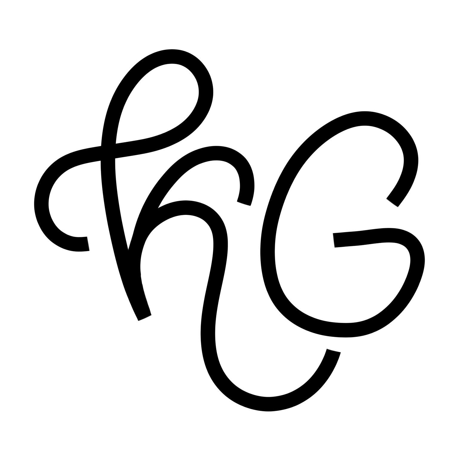
After finalizing the magazine name, I brainstormed some logo ideas, as shown in the sketches above. I tried various approaches, playing with the symbolism of pages as well as the wordmark itself. At the end, I went with a simple and elegant monoline wordmark that I felt suited the tone and the audience of the magazine.

Pages Magazine final logotype by Kristina Gorobets.

The Cover
I wanted the cover of the pride month issue to be bright and feature the colors of the pride flag. I knew I also wanted to feature some LGBTQIA+ books on the cover, so I looked up different lists to find books of the different pride flag colors. I created the illustration for the cover in Procreate and added the magazine/issue details around the framed design.

Pages Magazine cover design by Kristina Gorobets.​​​​​​​

Table of Contents
Another element of the magazine we were tasked with designing was the table of contents. Below I included the two possible layouts I envisioned for the issue, laid out on the flexible 12-part grid. After getting the feedback in class, I revised the second version and came up with the design below.

Pages Magazine table of contents ideation by Kristina Gorobets.

Pages Magazine table of contents by Kristina Gorobets. Mockup psd created by freepik - www.freepik.com

Pages Magazine feature article opening illustration by Kristina Gorobets.

Feature Story

The main component of the course was creating a multi-spread feature story for our magazine issue. After reflecting on my editorial lineup, I decided to adapt the "Representation of LGBTQIA+ Characters in Books Today" as my feature story, however, I ended up slightly reworking the story concept, titling it instead "The ABCs of LGBTQIA+" with the article being broken down letter by letter and featuring examples of that exact representation in the appropriate section.
The opening page of the article (on the left) is created by me using Procreate, as well as the rest of the illustrations featured in the article (not including book covers).

Pages Magazine feature article ideation by Kristina Gorobets.

The feature article content was taken from epicreads.com and cut down and rearranged to fit the purposes of the project. I typeset and organized the presentation of the content to create a connection between the text and the related book covers. I used the eyedropper tool to pick key colors of each book cover and used those colors for the number circles. In a few instances, I also added curving arrows to further clarify the books with the corresponding text and to add visual interest. I found that using colored circles provided an additional opportunity to make the article as bright and colorful as possible, which made sense for the issue theme.

Pages Magazine feature article opening spread by Kristina Gorobets.

Pages Magazine feature article spread 2 by Kristina Gorobets.

The grey areas on the pages represent advertisement spaces.

Pages Magazine feature article spread 3 by Kristina Gorobets.

I created small letter and person illustrations for the LGB sections, using the colors of their corresponding pride flags. I also created small and medium supplementary illustrations for the article. For the books after the B section, I created colorful ellipsis to symbolize the rest of the "alphabet" - unfortunately, it would have been too crowded to include the different mini illustrations all on one page/spread, as there are too many labels to cover in the span of one article.

Pages Magazine feature article spread 4 by Kristina Gorobets.

Subscription Component
The last component of the assignment was developing a subscription model and creating two online advertisements, a subscription form, and a blow-in card to advertise the subscription.

Pages Magazine online tower ad mock up by Kristina Gorobets.

Pages Magazine online big box ad mock up by Kristina Gorobets.

The online ads I created were simple and informative, fitting the youthful aesthetic of the brand. I created a tower ad (left) and a big box ad (right), playing with element sizes and layout to find the most effective design that would attract the magazine readers. I then added them into a mock up of the Pages website subscription page (below) to demonstrate their application.

Pages Magazine online subscription form mock up by Kristina Gorobets.

In addition to the subscription page, I mocked up two potential digital adaptations/extentions of the feature article in the print magazine, shown below.

Pages Magazine online article mock up by Kristina Gorobets.

Pages Magazine online quiz mock up by Kristina Gorobets.

Blow-In Card
Finally, I designed a blow-in card that would be used to promote the subscription to customers that bought the physical magazine. I considered the magazine audience and decided to design a card that they could use as a decorative element, with only one side featuring promotional content. I knew that the magazine audience are young people with appreciation for aesthetic elements, they are creative, and they appreciate functional items. They are also young and would be more inclined to subscribe online rather than sending a physical subscription form over mail, even if pre-paid. These considerations lead me to create the design below, with one side functioning as a beautiful illustrated card, and the second - as the promotion for the subscription service, with a clear cll to action and the website link.

Pages Magazine blow-in card design (front) by Kristina Gorobets.

Pages Magazine blow-in card design (back) by Kristina Gorobets.
The Result
Overall, I received an overwhelmingly positive response to the idea and execution from my professor, who ultimately asked my permission to feature this project in a Graphic Designers of Canada Instagram post on her as a teacher. I am also very happy with the final design, and it is one of my favorite projects to date.
Back to Top