Parallels Music Festival Brochure Mock-up (front) by Kristina Gorobets.
Role: Graphic Designer
Team: Solo project
Context: A print design assignment for PUB 131: Publishing Design Technologies course at Simon Fraser University
Tools: Adobe Illustrator, Photoshop, InDesign
Process
For this publishing design assignment, I was tasked with choosing or imagining an event and creating a design for a tri-fold brochure for this event. I've always wanted to design a music festival poster or brochure, so I came up with Parallels.
The Logo
Parallels Music Festival Logo by Kristina Gorobets.
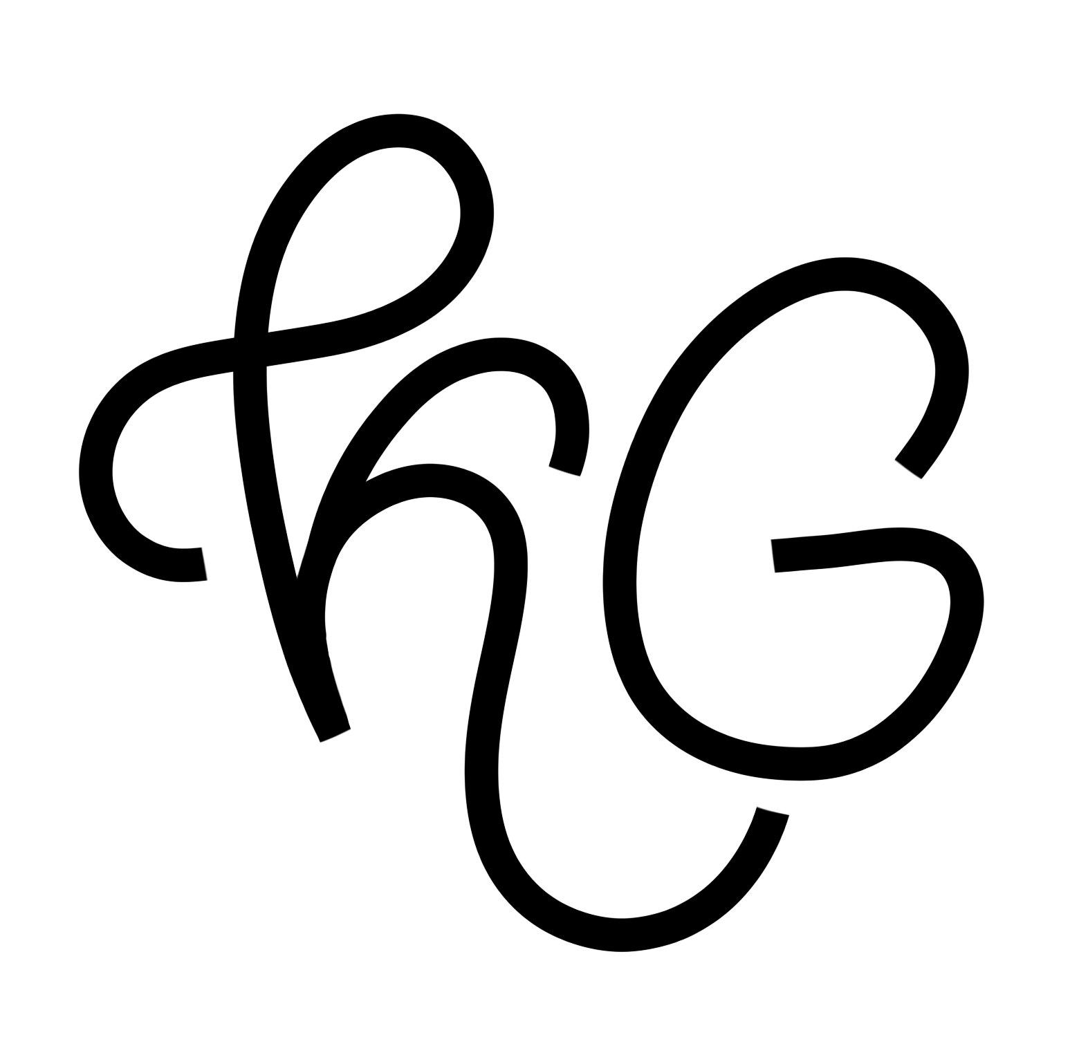
I came up with the logo very quickly. I wanted it to reflect the sense that it was music-related, and after drawing an abstracted musical note, I tweaked it so that it's sides were parallel to each other.
The Icons
I've had a lot of practice designing icons for numerous design projects over the course of my four years of designing, and I wanted to keep this set consistent with the logo and the brand in general. I used the same gradient as the logo and kept all icons rounded and stylistically cohesive.


From left to right: Location, Date, and Facebook icon design by Kristina Gorobets.
The Map
For the assignment, one of the requirements was creating a map. I took inspiration from an existing map for a previous Skookum festival, combined with a screenshot of the Google Maps location, and designed a set of icons to represent different facilities on the map. As you may notice, I kept the color scheme cohesive with the brand.
Parallels Music Festival Map Illustration by Kristina Gorobets.
The Result
The images used for the project were all found on Unsplash, except for the artist images, which were sourced from different websites. I color corrected and cropped all images for the brochure, and worked in InDesign using a grid system to come up with this final design.
Parallels Music Festival Brochure design (front) by Kristina Gorobets.
Parallels Music Festival Brochure design (back) by Kristina Gorobets.
My brochure design received special recognition in class and overall turned out very well. I learned about print design in physical space (how a person reads a brochure, which content will be perceived first, etc); design consistency - ensuring all images fit the tone of the overall design; and photo editing for print and how it is different from designing for the digital space.
After assignment submission and feedback, I switched the original placement of the Day 1 and Day 2 schedules to the way you see above. I learned that the viewer, upon opening the brochure, would see the Day 2 schedule before Day 1, which created logical confusion. The final version that you see above is the final iteration based on instructor feedback.
Parallels Music Festival Brochure Mock-up (back) by Kristina Gorobets.
